Layered Stencil Ink Blending: Swan Serenade Card Tutorial
Key Takeaways
Primary Technique: Utilizes layered stencil ink blending with the Altenew Swan Serenade set to create depth and dimension.
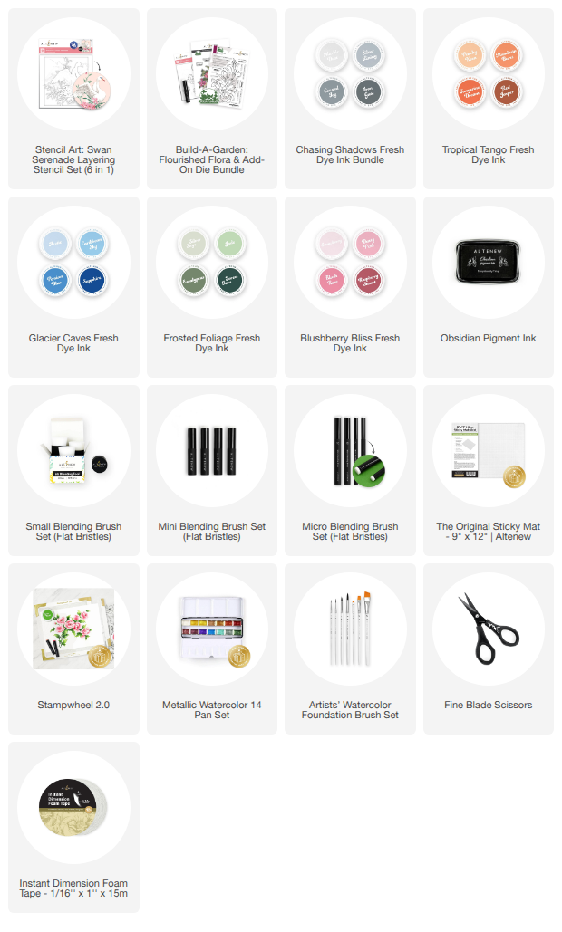
Essential Tools: A 9x12 Sticky Mat secures layers, while mini and micro blending brushes provide precision for intricate floral details.
Color Palette: Features a serene mix of Glacier Caves (blues), Frosted Foliage (greens), and Blushberry Bliss (pinks) Fresh Dye Inks.
Background Strategy: A soft wash of Cotton Candy and Peachy Keen inks adds atmosphere without distracting from the focal image.
Finishing Touches: Adds elegance via gold metallic watercolor splatters and a crisp sentiment stamped in Obsidian Pigment Ink.
Dimension: Employs foam tape and die-cut sentiment layering to create a professional, multi-layered card structure.
Hi, this is Mindy, and I’m so glad to be back on the Altenew blog! Today I’m sharing a soft and serene card design featuring the beautiful Stencil Art: Swan Serenade Layering Stencil. This project is all about the art of layered stencil ink blending, thoughtful color layering, and creating a peaceful scene that feels both elegant and magical.

Mastering the Layered Stencil Ink Blending Technique
There’s something incredibly calming about building a scene one layer at a time, and this card truly captures that peaceful feeling. Using the Stencil Art: Swan Serenade Layering Stencil, I created a beautiful focal image of a swan gracefully spreading its wing while nestled among soft florals.
The beauty of layered stencil ink blending is how each stencil layer adds progressive depth and detail. By working systematically, the scene comes together in a way that feels dimensional and professional, even if you are new to cardmaking.
Choosing the Perfect Inks for Soft Blending
To keep everything secure while blending, I used a 9x12 Sticky Mat—this makes a huge difference when working with multiple stencil layers, ensuring your paper doesn't shift mid-blend.
For the color palette, I followed the Altenew color inspiration guide for a cohesive look:
The Swan: I used the Glacier Caves Fresh Dye Ink Collection for the swan’s wings. These soft blue tones add just enough color while still keeping the swan looking light and airy.
The Florals: For the greenery and blooms, I brought in the Frosted Foliage and Blushberry Bliss Fresh Dye Ink collections.
Pro-Tip: Leaving a bit of white space within the stenciled areas provides the eye with a place to rest, which is crucial for maintaining that "serene" aesthetic.

Building a Dreamy Blended Background
One of the standout features of this stencil set is the ability to add color to the background using a dedicated stencil layer. Instead of leaving it plain, I utilized a soft ink blending technique with a mix of Cotton Candy and Peachy Keen inks.
By applying a dreamy wash behind the swan and florals, I added depth to the card without competing with the focal image. This step bridges the gap between the white cardstock and the vibrant stenciled elements.
The Importance of Blending Brush Sizes
Using different blending brush sizes really helps refine your results and is a key part of successful layered stencil ink blending.
Large & Small Blending Brushes: Ideal for larger areas like the background wash to get smooth, even coverage.
Mini & Micro Blending Brushes: Essential when working on more detailed areas like petals, leaves, and stems.
These smaller brushes give you much better control, helping you stay within the stencil lines while still achieving those soft, seamless gradients that make the Swan Serenade set shine.

Adding Finishing Touches and Shimmer
To elevate the design further, I splattered the background with Gold Metallic Watercolor. It adds just the right amount of shimmer and visual interest while still keeping the overall look soft and elegant.
Once dry, I trimmed the panel down to $3\ 3/4" \times 5"$, added foam tape to the back, and adhered it to an A2 card base ($4\ 1/4" \times 5\ 1/2"$) for dimension.
For the sentiment, I chose the Build-A-Garden: Flourished Flora. I stamped it using Obsidian Pigment Ink with a stamp positioning tool to ensure a perfectly crisp impression. After die-cutting with the coordinating die, I layered it with extra cardstock for dimension and added it to the card front.

Final Thoughts
This card really highlights how layered stencil ink blending and thoughtful color choices can create a peaceful, cohesive design. The combination of gentle colors, controlled blending, and subtle shimmer brings everything together beautifully.
Taking the time to build each layer and use the right tools makes all the difference—and the end result is a serene scene that feels truly magical!
How do you like to use your layering stencils? Do you prefer bold colors or a soft, blended look?

SUPPLY LIST