Less Is More: Creating Impact with White Space
Key Takeaways
Define White Space: In card design, white space refers to the open, unembellished areas of a layout—not just the color white. It provides "breathing room" that balances a card and guides the viewer's eye to the central image.
Highlight the Focal Point: Using a smaller, intricate die paired with ample negative space ensures the main design remains the star of the show without getting lost in a busy background.
Control Ink Placement: Relying on small and mini blending brushes allows you to isolate color (using shades like Ocean Waves and Almond Butter) to ground your image without bleeding into your designated white space.
Add Clean Dimension: You can create depth without adding clutter by building an elevated window panel backed with clear acetate. This creates a professional, shadowed look while maintaining a clean and simple card layout.
Balance Shine and Sparkle: Combining a subtle glitter cardstock for the main image with a crisp, hot-foiled sentiment (Satin Brass) adds elegant texture and shine without overwhelming a minimalist design.
Welcome friends! It's Mindy Eggen here with another episode of Inking It Up With Mindy on the Altenew YouTube channel.
Today, I'm sharing a handmade card project inspired by the beautiful Coral Arch Die Set. The smaller, delicate size of this specific die is actually what inspired the entire theme for today's project—embracing white space and letting your focal point be the absolute star of the show.

What is White Space in Card Design?
Sometimes it's incredibly tempting to fill every single inch of a card front with layers, stamps, and embellishments. However, learning how to use white space in card making can be just as important as the physical elements we choose to add.
What exactly is white space?
White space doesn't literally have to mean the color white. Instead, it simply refers to the negative or open areas of a design that aren't filled with images, heavy patterns, or bulky embellishments.
Think of it as essential breathing room for your card. Those open spaces serve a vital structural purpose: they help guide the viewer's eye directly to your main focal point, create visual balance, and often make a final design feel more polished, professional, and intentional. Sometimes, resisting the urge to add "just one more thing" is exactly what can make the biggest impact on your paper crafting projects.
Step-by-Step Clean and Simple Card Tutorial

1. Intricate Die Cutting with Glitter Cardstock
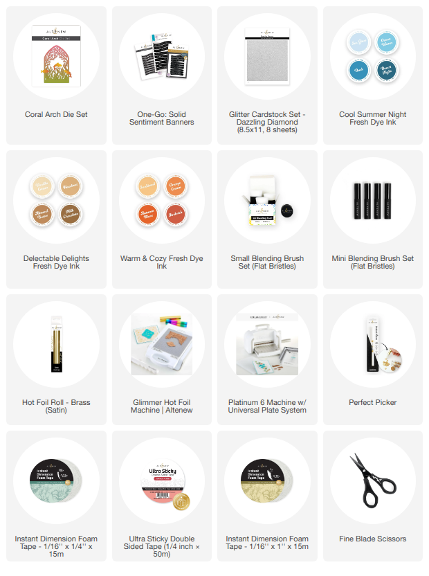
For my featured card design, I die cut the gorgeous Coral Arch Die Set from Dazzling Diamond Glitter Cardstock. Crafting with specialty paper like glitter cardstock can sometimes be a little tricky when you are using intricate dies.
Because of this, in today's video tutorial, I'm sharing a few of my favorite go-to die cutting tips that help you get a perfectly clean cut every single time, while still preserving all of those beautiful, intricate details of the coral.
2. Selective Ink Blending for Background Grounding
To create a little bit of grounding and depth directly behind the coral element, I ink blended a small, targeted area of the cardstock using Altenew's Ocean Waves and Almond Butter inks.
Using a precise combination of small and Mini Blending Brushes made it incredibly easy to control exactly where the color was placed without overwhelming the surrounding negative space. To finish off the scene, I also added just a subtle touch of Sunkissed ink to the fish for a soft, vibrant pop of color.
3. Adding Dimension with a Hidden Window Panel
To build up dimension without cluttering the clean and simple layout, I created a custom window panel and carefully adhered clear acetate behind the opening.
This window panel is popped up with foam adhesive directly over the ink-blended background. This technique creates a beautifully layered, shadow-box look while still keeping the overall design feeling clean, spacious, and open. Be sure to watch the full video below for a closer look at how easily this all comes together!
4. Flawless Hot Foiling for Sentiments
For the card sentiment, I used the One Go Solid Sentiment Banners and foiled it with a stunning Satin Brass foil using the Glimmer Hot Foil System. The foiled sentiment adds just the right touch of elegant shine to the card layout and complements the subtle sparkle from the diamond glitter cardstock beautifully.

Why This Clean and Simple Card Design Works
If you are looking to replicate this look in your own craft room, here is a quick breakdown of why this minimalist design composition is so visually effective:
The Window Panel Adds Depth: It introduces physical dimension and shadows without making the card layout feel busy or overcrowded.
Targeted Ink Blending: The soft background ink blending helps draw immediate attention to the focal image rather than taking over the entire card panel.
Acetate Elements: The clear acetate creates a seamless, professional layered look that keeps the card feeling light.
Strategic Foam Adhesive: Popping up the main panel adds instant depth and structural interest to a minimalist card.
Embracing Negative Space: Leaving plenty of purposeful white space keeps the design clean, perfectly balanced, and allows your main focal point to truly shine.
VIDEO
Be sure to check out the full video tutorial below for an in-depth, step-by-step look at this project. You'll learn my favorite expert tips for die cutting intricate designs, mastering hot foiling sentiments, and ink blending smaller areas while still creating a handmade card with plenty of wow-factor impact!

Frequently Asked Questions
How do you use white space effectively in card making?
To use white space effectively, pick one central focal point (like the Coral Arch Die Set) and leave the surrounding 50-60% of the card front free of busy patterns or heavy embellishments. This guides the recipient's eye directly to your main design.
What are some tips for die cutting intricate dies out of glitter cardstock?
When die cutting intricate designs with glitter cardstock, use a metal shim or run the die through your die cutting machine back and forth an extra time. This ensures the blades fully pierce through the thick, textured glitter coating.
Why should I use mini blending brushes for card making?
Mini blending brushes offer superior ink control. They allow you to apply soft ink blending to specific, isolated areas of your handmade cards without accidentally spreading the ink into your designated white space areas.

SUPPLIES