3 Easy Paper Crafting Design Tricks for Layered Cards
KEY TAKEAWAYS
Anchor Your Design to 3 Pillars: When facing a creative block, simplify your cardmaking process by focusing strictly on Color, Texture, and Layers.
Build Depth with Monochromatic Palettes: Use cascading cardstock shades from light to dark (such as a gradient of blues and slates) to create an instant, natural sense of visual perspective.
Mimic Canvas Texture Using Markers: You do not need expensive textured papers; use alcohol markers and acrylic paint pens to apply fine dots and horizontal strokes to give plain cardstock a hand-painted look.
Vary Dimension to Guide the Eye: Avoid flat designs by using liquid glue for background elements and foam tape to pop up focal pieces, creating contrasting heights that invite interaction.
Enhance with Mixed Media Accents: Complete the scene with simple finishing touches like ink splatters to replicate light reflections and high-shine sequins for a touch of realistic shimmer.
Hey there everyone, it’s Jaycee! Welcome back to another Perfect Pairing.
We’ve all been there: the post-spring slide hits, the creative momentum stalls, and suddenly a blank craft desk feels more daunting than inspiring. When I find myself stuck in a creative paper crafting rut, my absolute favorite way to break the gridlock is to step back from the overwhelm and simplify my approach.
Instead of getting bogged down by intricate planning, I anchor my design process to just three fundamental pillars: Color, Texture, and Layers.
By filtering your choices through these three cards making design principles, the elements of a card almost begin to pair themselves. To show you this formula in action, let’s break down how a few focused choices can transform simple cardstock into a tranquil, impressionist-inspired pond scene.

1. Color: Grounding Your Card Design Story in Nature
When you don't know where to start, start with a reference. Choosing a color palette doesn't have to be a guessing game; it can be as simple as anchoring your card to a memory, a photo, or a specific mood.
To create the deep, reflective stillness of a shaded pond, I relied on a graduating monochromatic palette of rich blues and slate tones. Using a stepped layout like the Ocean Windows Die Set allows the colors to do the heavy lifting for you. By cascading cardstock tones—moving from a crisp Pure Graphite frame in the foreground down through Cloudy Sky, Nimbus, and Desert Night, all the way to a solid Dark Night base—the paper itself builds a natural sense of perspective and depth before you even touch a medium.
Design Tip: If your foreground frame feels a bit flat, gently blend a coordinating ink (like Pure Graphite Fresh Dye Ink) around the outer perimeter. Deepening the outermost edges creates a subtle vignette, immediately drawing the eye inward toward the center of your scene.

2. Texture: Bringing Plain Paper Crafting Elements to Life
Once your color foundation is set, texture is what gives the scene its soul. You don't always need specialized tactile papers to achieve this; you can build incredible visual texture using your favorite coloring mediums.
For this project, I drew inspiration from Claude Monet’s iconic Water Lilies series. By using alcohol markers and acrylic markers to apply fine dots and short, deliberate horizontal strokes across the distinct cardstock layers, you replicate the raw look of an artist's canvas.
On the water layers: Fine lines of blues and whites mimic the gentle ripples of still water and the illusion of dappled, shifting sunlight.
On the frame: Rich greens applied in an irregular, horizontal formation evokes the ornamental grasses and dense foliage enclosing a hidden pond.
On the botanicals: Don't underestimate the power of specialty materials. Introducing soft, translucent vellum elements into your die-cuts adds an airy, peaceful texture without introducing competing colors that might disrupt the mood.

3. Layers: Creating a Focal Journey on Handmade Cards
The final pillar of the formula is composition through layering. Layering isn't just about stacking pieces together; it's about creating a visual path for your card recipient to follow.
In this tranquil arrangement, the Ocean Window layers establish the structural environment, but the focal story belongs to the wild elements. An elegant pair of hand-patterned koi fish and scattered lily pads cross over the boundaries of the die-cut windows, breaking the grid and making the scene feel alive.
To make your layers impactful, vary your dimensions. Use liquid glue to anchor the delicate lilies and koi fish around the periphery of the still pond, but utilize foam tape to lift up select lily pads. This creates contrasting levels of height that draw the eye through different pockets of interest.

The Finishing Touches for Professional Layered Cards
A truly finished design relies on the subtle details that tie the three pillars together. To finalize this impressionistic look, a light splatter of Pure White Ink Spray across the completed scene gives the ultimate effect of light dancing on a water surface. Finally, a scattered handful of clear, high-shine sequins adds literal reflection and visual shine, preserving the peaceful, sophisticated tone of the card.
The next time you find yourself staring at a blank craft desk, try letting go of the pressure to create a complex masterpiece. Clear away the noise, focus purely on color, texture, and layers, and watch how quickly your creative flow state returns.

FAQ: Frequently Asked Questions About Designing Layered Cards
What glue is best for making layered cards?
For flat, detailed elements, a high-quality liquid glue with a fine tip works best. To create dramatic depth and shadow effects between your card layers, use double-sided foam tape or foam dots.
How do you choose a color scheme for a layered card?
The easiest way to choose a color scheme is to use a monochromatic gradient (shades of the same color family) or look at a reference photo from nature. Moving from light to dark paper shades automatically creates a 3D perspective.
In Case You Missed It

Missed the live session with Jen? Don't worry—you can still catch the full replay to master the art of soft color blending, delicate layering, and ethereal paper crafting.
Learn Dreamy Techniques: Discover how to use vellum, light ink blending, and strategic layering to create a calm, airy aesthetic.
Get Inspired: Watch step-by-step project creation and pick up tips to break through your creative block.
Join the Community: See the ideas shared during the live chat and get inspired by fellow crafters.
Join the Challenge & Win!
Watch the video, recreate the look, and share your project on social media using #altenewchallengelive. You’ll be entered for a chance to WIN a prize and be featured in our next session!
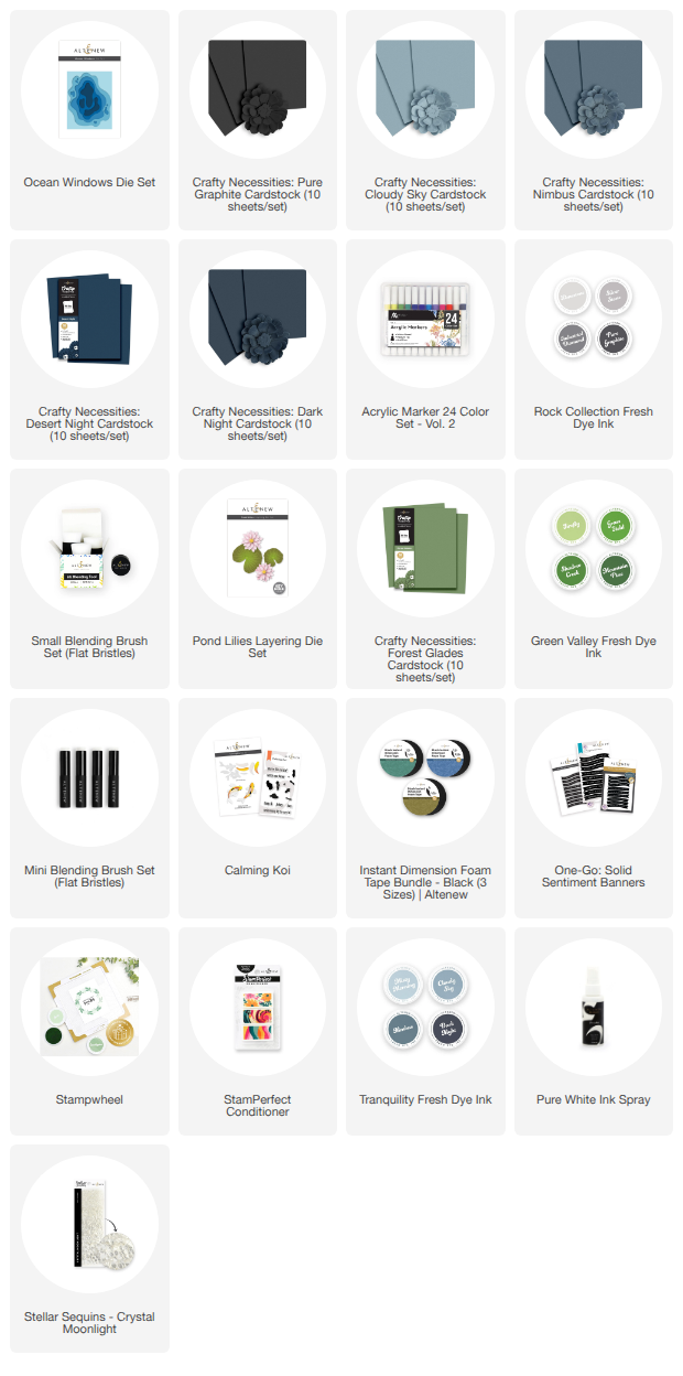
Supply List