Making Intentional Choices to Create a Coordinating Card Set!
Hi friends! Emily Midgett here with you today on the Altenew Blog, and I have a pair of coordinating card set that use two different techniques but take advantage of the matching color palettes in the Firewood Garden and Woodland Garden Artists Alcohol Markers and their coordinating colors in the Fresh Dye Ink line.
How to Make Intentional Choices to Create a Coordinating Card Set
Whenever I am creating, my goal is to create as seamless a feel as possible for each element of my card, making sure that each individual piece coordinates with some other element on the card so that everything looks cohesive and intentional. The fact that Altenew offers coordinating inks, coloring mediums, and now colored cardstock means that I can coordinate each element of my projects and create unique but coordinating card set. Let's get started with the details on my projects!

These projects began with the selection of the new Build-A-Garden Lovely Rose Peony stamp set. I love the color palette for the Firewood Garden Artists Alcohol Markers and the gorgeous blues in the Woodland Garden Artists Alcohol Markers, so I paired those colors with the beautiful floral image from the Build-A-Garden Lovely Rose Peony.
Tips on How to Create a Coordinating Card Set
When creating a coordinating card set, I like to first select my color palette, then begin pulling different elements that fit that color palette, whether it is cardstock, inks, color mediums, or embellishments. Once I have all of the elements gathered up, I start piecing together the cards in my mind using the different individual pieces.

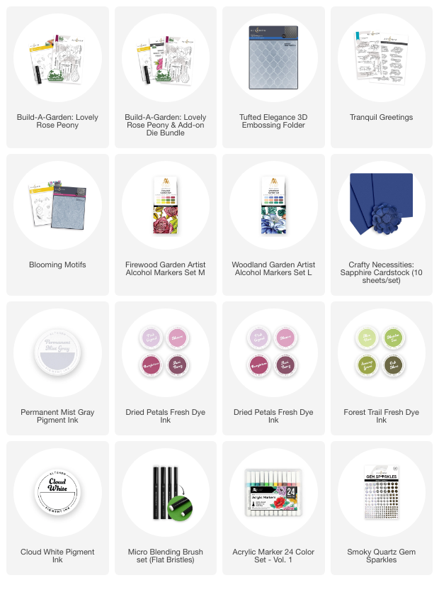
To start my first card, I stamped the floral image from the Build-A-Garden Lovely Rose Peony set onto some white cardstock using Permanent Mist Gray Ink to do some no-line coloring. I then used the pink and green markers from the Firewood Garden Artists Alcohol Marker set to add some beautiful color to the images. Because it can be a bit challenging to create the super detailed flower stamens for the flower centers, I ignored the lines for the stamens while coloring with the alcohol markers, preferring to stencil some Cloud White pigment ink with the coordinating stencil after I'd finished coloring.
Tip: The pigment ink acts as a bit of a barrier for the yellow Acrylic Marker that I used to add color to the flower centers.

Tip: Mixing mediums allows more creative freedom.
Next, I allowed the stenciled white pigment ink plenty of time to dry before adding the yellow Acrylic Marker directly over the top of the white stenciled area. I colored the entire area with longer swipes, then used a dotting motion to add extra texture and interest, finally adding some white gel pen for even more details. Once I had finished coloring the images, I die cut the bouquet with the coordinating die and used the Delphinium marker from the Woodland Garden Artists Alcohol Markers around the edges of the die cut to coordinate with the card base.

Tip: The little details make a difference.
For the card base, I ran an A2 panel of the Sapphire cardstock through my die cutting machine using the Tufted Elegance 3D Embossing Folder. The Sapphire cardstock coordinated beautifully with the Delphinium marker edges on the floral bouquet. I swiped the Arctic Mountain Fresh Dye Ink directly over the top of the embossed panel, which helps to make the embossed pattern stand out a bit more.
It's super easy to do this swiping method with the Fresh Dye Inks due to their stiff canvas ink pad; it allows you to swipe without fear of getting too much ink on your cardstock!
I popped up the floral die-cut and added a stamped, embossed, and die cut greeting created using the Tranquil Greetings product suite. Finally, I added some Smoky Quartz Gem Sparkles for a bit of bling!

For my second project, I carried the blue, pink, and green color palette over, this time choosing to pair the Blooming Motifs 3D Embossing Folder with Arctic Mountain, Mauve, Berrylicious, and Swamp Green Fresh Dye Ink. I was able to use all of these colors on the embossed image without the coordinating stencils by using the super popular “swipe” method on the back side of the embossed panel!
I started by embossing a panel of white cardstock using the Blooming Motifs 3D Embossing Folder, which I then flipped over so that the pattern was pressed down into the cardstock rather than raised up. On this now-debossed panel, I used micro blending brushes to blend Mauve, Berrylicious, and Swamp Green Fresh Dye Ink on the individual images. (Bonus: these inks coordinate beautifully with the alcohol marker colors from the first card to help create the coordinating set!)
I then swiped the Arctic Mountain ink pad directly over the top of the blended, debossed panel; the stiff pad keeps the ink only on the raised areas and allows you to create a completely color-saturated panel with tons of texture, color, and interest!

Because the background is so vivid and busy, I decided to put a spotlight on the sentiment focal point with some vellum. I die cut a shape from the Ornate Nesting Die set from some shimmery vellum and adhered another embossed and die cut sentiment from the beautiful Tranquil Greetings product suite, embossed on more Sapphire cardstock.
I adhered the sentiment die-cut to the center of the vellum die-cut with some foam adhesive, then decided to enhance the focal point with a coordinating bow. I cut a length of thin white silk ribbon, then used the Delphinium marker from the Woodland Garden Artists Alcohol Marker set to dye the ribbon a coordinating shade of blue. I adhered the bow to the vellum die-cut and flipped the whole thing over to add my adhesive behind the solid die cut and bow. I adhered the focal point in the center of the colorful debossed background; the vellum softens the busy pattern while not covering it completely and still allows the sentiment to be easily seen. Finally, I added a few iridescent Smoky Quartz Gem Sparkles for more shimmer and texture.
Well, that's all for my projects today!
I love creating coordinating card sets; mixing and matching different elements in the same colors is like putting together a puzzle for me. I hope these projects have inspired you to see what you have that can coordinate! It's so great to have an array of colorful products that coordinate as well as the inks, coloring mediums, and cardstock from Altenew do.
Thanks so much for stopping by today, and have a marvelous day!
~Supply List~