Master Color Mapping in Card Making: The 60-30-10 Rule
by Jaycee Gaspar August 23, 2026

KEY TAKEAWAYS
Master the 60-30-10 Rule: Eliminate color paralysis by assigning strict roles to your inks—60% Dominant for backgrounds and greenery (Tranquil Reflections), 30% Secondary for hero florals (Vintage Study), and 10% Accent for high-contrast pops (Highland Flora).
Work Smarter with One-Go Systems: Maximize efficiency by pairing the One-Go: Briar Blossoms stamp, stencil, 3D embossing folder, and single-pass die to mass-produce detailed, textured florals in a fraction of the time.
Anchor for Precise Alignment: Use a fixed corner anchor point on your Stampwheel when stamping your initial guide outline. This ensures perfect registration when re-stamping crisp outline details after ink blending.
Emboss After Partial Die-Cutting: Keep your die-cut pieces nested inside the cardstock panel after running them through the die-cutting machine. This allows you to align and emboss the entire cluster in a single pass through the 3D embossing folder.
Balance Intimidating Shades: Use strong accent colors—like deep purples or bright jewel tones—sparingly in flower centers, small botanical details, and focal sentiments to energize your design without overwhelming the palette.
Have you ever looked at a brand-new set of fresh ink pads and felt a mix of pure excitement and total decision paralysis? Breaking out of your crafting color comfort zone can be tough—especially when trying to integrate unexpected shades like deep purples or cool grays into a cohesive, elegant floral card design.
In this edition of Perfect Pairings, we are solving color paralysis head-on using a classic interior design framework: the 60-30-10 color mapping rule. By assigning strict percentage roles to Altenew’s Fresh Dye Ink releases—Tranquil Reflections, Vintage Study, and Highland Flora—you can make any color combination feel effortless, intentional, and perfectly balanced.

What is Color Mapping? The 60-30-10 Palette Breakdown
The secret to preventing color chaos on handmade cards is structural color mapping. Before opening a single ink pad, map your colors into three distinct visual roles:
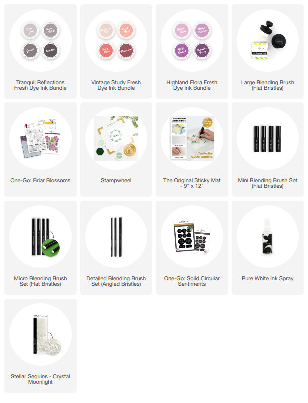
60% Dominant Anchor (Tranquil Reflections): Cool, misty grays (Dove Gray, Stone Wall, Gravel, Shadow) carry the heavy lifting. They create a soft, atmospheric background and anchor the extensive foliage and stems, keeping the overall handmade card grounded without competing for attention.
30% Secondary Focal Point (Vintage Study): Warm, antique terracottas (Parchment Pink, Coral Dust, Rosy Terra, Rosewood) bring the main hero floral elements to life. They provide enough visual weight to draw the eye directly to the center wild rose blooms.
10% Accent Pop (Highland Flora): Rich, moody purples (Thistle Floret, Wild Orchid, Bramble Berry) serve strictly as high-contrast focal accents. Used sparingly on rose hips, flower centers, and a bold sentiment, this 10% accent pop energizes the palette without overpowering the softer petals.

Step-by-Step Card Making Guide: Executing the 60-30-10 Ink Ratio
1. Building the 60% Dominant Foundation
Background Blending: Blend Dove Gray over the top two-thirds of a standard A2 cardstock panel (4.25 x 5.5 inches) using a large ink blending brush. This soft gray canvas sets the overall tone of your card.
Foliage & Stems: Using the One-Go: Briar Blossoms stencil, apply Stone Wall as your base layer across all leaves, deepen the shadows with Gravel, and add crisp vein details with Shadow. Carrying these grays through both the background and greenery guarantees that 60% of your card’s visual real estate remains unified.
2. Layering the 30% Secondary Florals
Petal Base: On stencil layers 1 and 2, apply Parchment Pink near the flower centers, blending out to Coral Dust toward the outer edges.
Shading & Dimension: Add realistic blended shadows using Rosy Terra with a detailed angled brush, following the natural curve of the petal lines. Finish the flower centers with a light touch of Rosewood. These warm terracotta tones dominate the central flowers, achieving the ideal 30% visual contrast against the cool gray foliage.
3. Applying the 10% Accent Pops
Rose Hips & Centers: Stencil the small rose hips with Thistle Floret and Wild Orchid, creating a curved gradient that mimics a glossy finish. Fill the tiny flower centers with Bramble Berry.
Focal Sentiment: Press the One-Go: Solid Circular Sentiments plate using Wild Orchid ink onto white cardstock, then die-cut the finished sentiment.

Card Assembly & Finishing Touches
- Precision Stamping & 3D Texture: After allowing your dye inks to set, re-stamp the fine outlines in Shadow Fresh Dye Ink using a precision stamping wheel. Die-cut the elements using the single-pass One-Go: Briar Blossoms die, run the nested pieces through the matching 3D embossing folder, and gently pop out the textured die cuts.
Combining the Color Ratios: Arrange your 30% terracotta florals and 60% gray foliage over the blended gray card base. Foam-mount the 10% purple sentiment directly into the center floral opening for maximum visual impact.
Final Flourishes: Finish your card with a subtle splash of Pure White Ink Spray splatter and a delicate scatter of Crystal Moonlight Stellar Sequins.
By strictly adhering to the 60-30-10 color framework, even intimidating shades like deep purple naturally find their place in a soft, cohesive card layout.

How do you tackle new ink color combinations in your craft room? Let us know your favorite color mapping tricks in the comments below!

For VIPs only: Get 2X Points on every order from August 23, 2026 at 12:01 AM EDT until 11:59 PM EDT. Shop here: https://oltonew.shop/collections/all-altenew-products
Not part of our Loyalty Program yet? Create a store account HERE to start earning your points for future savings!
Supply List for Jaycee's 60-30-10 Rule Card